Blog Post
Typeface vs Font vs Unicode: Stop Saying Font When You Mean Design
Typeface, font, and Unicode are not the same thing. Most people mix them up — here’s a clear breakdown of what each one means, how they relate, and why using the wrong word causes real problems.
Last Updated
I used to think “font” was the right word for everything. Then I noticed designers correcting people in comments, tools labeling things differently, and “Unicode fonts” behaving nothing like fonts at all. After a while, it became obvious that the problem isn’t the terminology—it’s that these ideas are usually explained in isolation, not together.
This confusion matters more than people think. Using the wrong term can make you sound inexperienced, choosing the wrong solution can break accessibility, and mistaking Unicode styles for fonts can cause real problems with SEO, copy-paste, and readability. Once you understand how these three concepts are different—and how they relate—you’ll never look at “fancy text” the same way again.
What Is a Typeface?
A typeface is the part you recognize instantly. You don’t have to think about size or weight to know when you’re looking at Times New Roman or Helvetica—you just know. When people say “font” in everyday conversation, this is usually what they’re pointing to.
Think of a typeface as a family. It defines the shape of the characters, how thick or thin strokes are, how curves look, and how formal or casual the text feels. The typeface itself doesn’t describe size, weight, or style—it just defines the design.
Historically, typefaces began as physical designs cast in metal. Each size and style of a typeface was a separate set of physical type. That history is still visible in how we talk about type today, even though almost everything has moved to digital.
What Is a Font?
A font is a specific version of a typeface. It’s the practical, usable file that tells your computer exactly how the typeface should appear in a certain style.
For example, if a typeface is a family, fonts are the individual family members:
- Regular
- Bold
- Italic
- Bold Italic
Typeface vs Font (The Simple Way to Remember)
If there’s one mental model that clears up most confusion, it’s this:
Typeface = design — You choose a typeface for its look.
Font = file — You install or use a font to apply that look in a specific way.
| Aspect | Typeface | Font | Unicode Styles |
|---|---|---|---|
| What it is | The visual design of characters | A specific file or variation of a typeface | Alternative characters with styled appearance |
| Controls appearance? | Yes (overall look) | Yes (weight, style) | Only imitates appearance |
| Changes the character itself? | No | No | Yes |
| SEO-friendly | Yes | Yes | No |
| Accessible for screen readers | Yes | Yes | Often problematic |
| Coverage | Unlimited (can design anything) | Limited to font file (200–20K glyphs) | Limited to specific Unicode blocks |
| Example | Helvetica | Helvetica Bold Italic | Fancy Text |
What Is Unicode?
Unicode has nothing to do with styling. It doesn’t care about fonts, weight, or appearance. All it does is assign numbers to characters so the same letter or symbol means the same thing across different devices and platforms.
For example, the letter “A” has a Unicode value U+0041. The emoji 😊 has Unicode value U+1F60A. Mathematical symbols, arrows, and scripts all have their own unique Unicode values.
The current Unicode standard defines over 150,000 characters covering 161 scripts—Latin, Arabic, Chinese, Japanese, Korean, Cyrillic, Devanagari, and dozens more—plus mathematical symbols, emoji, musical notation, and ancient scripts. Before Unicode, different countries used incompatible encoding systems, and text created on one system was often garbled on another.
Unicode answers the question: “What character is this?” — not how it should look.
What Are Unicode Styles?
Unicode styles are not fonts and not typefaces. They are alternative characters that look styled but are actually different characters underneath.
- Bold text made with Unicode is not bold formatting
- Script text is not a script font
- Fancy letters are separate Unicode characters
Where Do Unicode Styles Come From?
Most “fancy text” Unicode styles come from a part of the Unicode standard called the Mathematical Alphanumeric Symbols block (U+1D400–U+1D7FF). This block was added to Unicode specifically for mathematical and scientific notation, not for social media styling.
In advanced mathematics, a lowercase italic x represents a different variable than a bold lowercase x or a script lowercase x. Mathematicians needed these distinctions to be encodable in digital documents. The Unicode Consortium added bold, italic, script, fraktur, double-struck, and monospace variants of every Latin letter precisely for this technical need.
The mathematical community got their notation. The rest of us got fancy text generators. Both sides use the same Unicode additions for completely different purposes.
What Unicode Styles Cannot Do
Unicode styles have important limitations that most articles don’t mention:
This is why styled text often looks uneven: the letters change appearance but the spaces and punctuation stay the same, creating a mixed visual rhythm that’s hard to ignore once you notice it.
- Numbers 0–9 are available in some styles but not all
- Punctuation and spaces cannot be styled—a “bold space” does not exist in Unicode
- Non-Latin scripts (Cyrillic, Arabic, Chinese, etc.) have very limited or no styled variants
- Lowercase letters have fewer styled variants than uppercase in some blocks
- No single font contains the full Unicode character set—most fonts cover only 200–5,000 glyphs
How Unicode Works With Fonts and Typefaces
Here’s the key relationship most articles never explain clearly:
Unicode defines the character. Fonts decide how that character looks.
A font maps visual shapes (glyphs) to Unicode code points. When you type “A” (U+0041), the font looks up its glyph for that code point and draws it. The same code point rendered in Helvetica vs Times New Roman produces completely different shapes, but the character is still the same “A.”
Unicode styles break this relationship by swapping the character itself—not the font. “Bold A” (U+1D400) is a different code point than regular “A” (U+0041). The font draws whatever glyph it has for U+1D400, which happens to look bold. But the underlying character identity has changed.
Another important concept is font fallback. If the current font does not contain a glyph for a specific Unicode code point, the operating system automatically substitutes a different font that does. This is why fancy Unicode text usually renders: even if your chosen font lacks the Mathematical Alphanumeric block, the system falls back to a font that includes it. This fallback is invisible to users, but it means the text may appear in a completely different typeface than the surrounding content.
Platform Differences: How Unicode Text Renders Across Devices
The same Unicode code point can look different on different devices because every platform uses its own default fonts:
This means the styled bio you carefully compose on an iPhone may look heavier, narrower, or less refined when viewed on a Samsung Galaxy. The characters are the same—identical Unicode code points—but each platform’s font renders them differently. This is expected behavior, not a bug, but it matters when you are relying on a specific visual look.
The safest approach: test your styled text on at least one iOS device and one Android device before publishing. If it looks good on both, it will look acceptable everywhere.
- Apple devices use San Francisco—clean, modern rendering of styled characters
- Google Pixel and Android devices use Noto—broader coverage but different glyph shapes
- Samsung devices use Samsung Sans—slightly heavier, wide appearance
- Windows uses Segoe UI—often the most conservative rendering of styled blocks
Why Unicode Styles Are Not a Replacement for Fonts
Using Unicode characters to fake styles causes real problems:
- Screen readers may read characters as “mathematical bold capital H” instead of “H”—a short word like “Hello” becomes an unintelligible string of character descriptions
- Search engines may treat text as symbols, not words—styled content can be harder to index and match against normal-text searches
- Copy-paste behavior becomes inconsistent—pasting into forms, databases, or URL fields may reject or mangle styled characters
- Text may render differently across platforms—what looks polished on iPhone may feel clunky on Android
- Styling cannot be changed with CSS or design tools—if you want a different color or weight, you need different Unicode characters, not a style rule
A concrete example of the accessibility problem: When a screen reader encounters “apples AND bananas” where the “AND” is written in mathematical italic Unicode, it reads: “apples mathematical italic capital a mathematical italic capital n mathematical italic capital d bananas.” The intended word “and” becomes completely lost. This is not a hypothetical edge case—it happens daily to screen reader users across social media.
Unicode styles change what the text is, not how it’s styled. Fonts and typefaces do the opposite—and that difference matters.
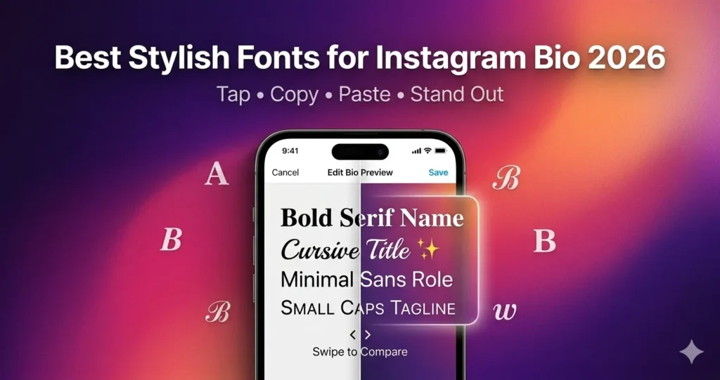
Practical Examples (When to Use What)
If you are using Unicode styles in a social media bio, keep these rules: use them only for your name or brand line, keep your main keywords in plain text, and test on both iPhone and Android before publishing.
The mistake is treating all of this as one thing. Typefaces define the look, fonts make that look usable, and Unicode works at a completely different level. That’s also why Unicode “styles” feel off—they’re copying the appearance without using typography at all.
- Use a typeface when choosing a visual identity or design direction
- Use fonts when applying specific styles like bold or italic in documents and web design
- Avoid Unicode styles for body text, SEO-important content, headings, or accessibility-sensitive text
- Use Unicode styles sparingly for short decorative text in social media bios, usernames, or captions where visual flair matters more than searchability
Quick Do & Don’t Guide
✅ Do
- Use fonts to apply bold, italic, or stylistic changes in documents and web design
- Choose typefaces based on visual identity and readability
- Use Unicode for symbols, emojis, and language characters only
- Test Unicode styled text on both iOS and Android before publishing
❌ Don’t
- Don’t use Unicode styles for headings or body text
- Don’t rely on Unicode characters for SEO-important content—Google may not index styled text as its plain equivalent
- Don’t assume styled Unicode text looks the same on every device
- Don’t use Unicode styles in contexts where screen reader accessibility matters (forms, educational content, instructions)
Summary
Typefaces define the look, fonts make that look usable, and Unicode works at a completely different level. When you treat them as the same thing, you risk confusing terminology, breaking accessibility, and hurting your SEO.
If you are working with text—whether in design, development, or content—understanding these three concepts lets you make better choices. Use typefaces for identity, fonts for implementation, and Unicode for what it was designed for: defining characters, not styling them.
Unicode styles have their place: short decorative text in social profiles, where visual personality matters more than readability or search. But they are not fonts, they are not typography, and they should not replace either one.